Context
The goal set out by Products was to assess the value of the dashboard on the Homepage, so that the team can make decisions on merging certain data points.
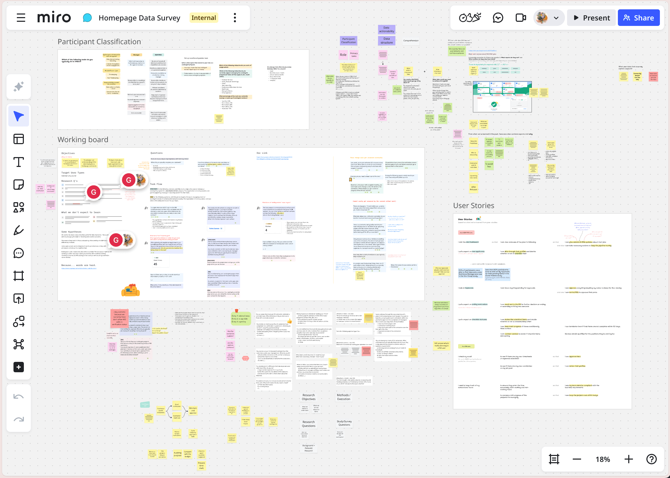
This project was handed to me after the method had already been decided. So a large part of my job was to understand the problem space, set realistic expectations with my partners, and design a study that could collect the best data the method would allow.
Process
Historically, many studies have shown that the dashboard isn’t particularly useful to users. Yet, product analytics revealed extremely high traffic. The information has placed the dashboard in an intriguing spot: low usability yet high impact.
By going through historical records and speaking with data experts, I discovered key insights that previous studies had overlooked. I also developed a hypothesis to explain the dashboard’s unusually high traffic.
So instead of assessing the value of the dashboard (for the nth time), I decided to pivot the research objectives to (1) evaluating the hypothesis and (2) identifying the gap between the data users needed and the data displayed on the dashboard.
The pre-selected method added a challenge to this research project. In order to collect qualitative data on current user behavior through a survey, I came up with a series of task-based questions for the participants to go through and provide their responses. The questions were asked around these 3 purposes:
The survey included multiple choice, short answer, and click-map questions, all connected through a storyline based on real scenarios from users’ day-to-day operation. Designing the survey in this interconnected way would help reduce bias in the responses.
The survey result showed me the user needs and their behavior in meeting those needs. Mapping it out with what the current system was offering, I was able to highlight the gap and made suggestions to improve the dashboard.
Furthermore, combining the traffic data and the result from click-map questions, I also pointed out the underlying problems with the global navigation and information architecture of the Homepage. Together, these findings explained why the dashboard had low usability but still yielded a high impact on the user experience.


Outcome
Getting back to the initial inquiry from Products, I was able to confidently recommend whether or not they should merge the data points.
Soon after, the insights also supported another team re-organize a portion of the Homepage as part of a rebranding project. Beyond that, the study has firmly discovered opportunities for an AI initiative in the organization.